Multilingual Desktop Publishing
Russian to English Localization Project in
Adobe Illustrator
A while ago I designed the packaging for five types of fruit jellies in Adobe Illustrator. The goal of my design was to create bright and vibrant packaging appealing to younger demographic. To address this and to reflect my own preferences, the project was designed using only angular shapes. The names of the jellies were written using manually created font, also with a lot of angular elements. I decided to localize that old project of mine from Russian into English.
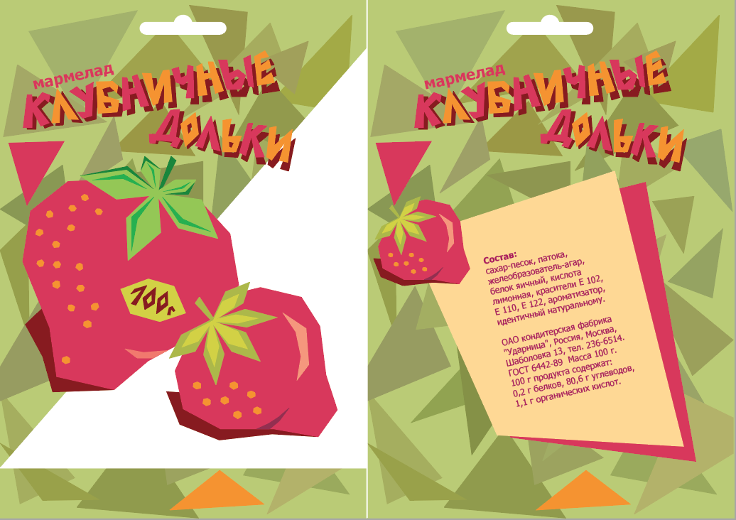
One of the original packages: Strawberry Jellies
Localization Challenges
Let’s look at the localization challenges that I encountered. As mentioned above, the lettering for the names of the jellies was created manually, and this process was extremely time-consuming and took me several days. Originally I was planning to recreate the same font in English manually as well, but then decided to use a more time-efficient method and to find an Adobe font that would match mine as close as possible. Considering my design approach, a decorative sans-serif with a lot of angular accents would work well. After looking through a few hundred fonts I found a reasonably close match — CCClobberinTimeSmooth Regular. (As a side note, this font doesn't have a Cyrillic script, so in case I decided to localize the project back into Russian using this font, I would have to create a Cyrillic script using an application like FontForge.)
After finding this substitution, I simply typed the name of a jelly in English using Type Tool, changed the colors of letters to match the original color choice and rotated the resulting text object to match the angle of the jelly name in Russian. I repeated the same sequence of steps for one more text element where the manual font was used, i.e. for the package weight typed on the label. The rest of the original text was created using easily localizable Tahoma, which didn’t present any challenges — I simply substituted it with an English adaptation.
Design Challenges
I found one more issue that I wanted to work on in this Illustrator project, namely the direction of the shadows under the jellies names and ingredients lists. For some reason in my original project it was opposite to the direction of the shadows under front pictures of fruits, so I decided to correct it. To create a shadow, I copied a text object with a jelly name, changed the color to brown, sent the object backward and rotated it to match the direction of the shadow under the fruit. To modify the shadows under the ingredients lists, I simply ungrouped and rotated them. Finally, for design purposes I moved the small pictures of fruits on the back of packaging from left to right, as I changed the position of the shadows under the ingredients lists, and keeping small fruits where they had been originally would overcrowd this area of artwork.
Results
Let's look at the results of localization of all five pairs of packaging.
Strawberry

Russian
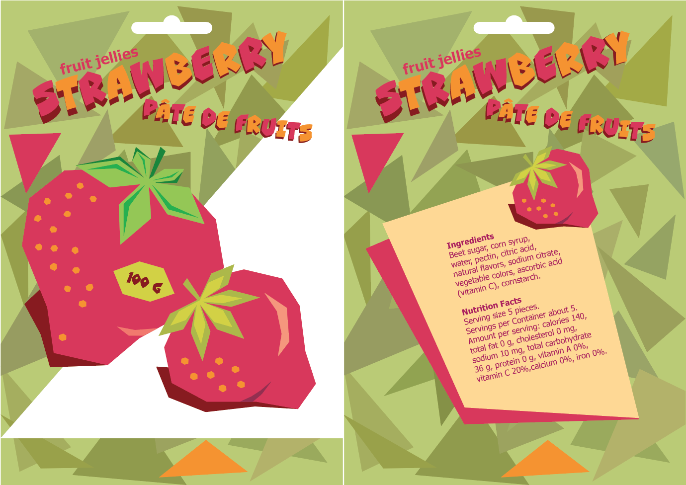
English
Apple
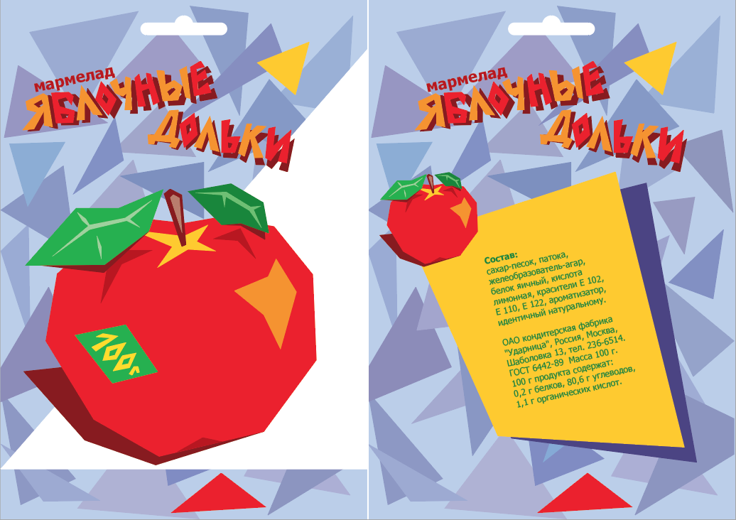
Russian
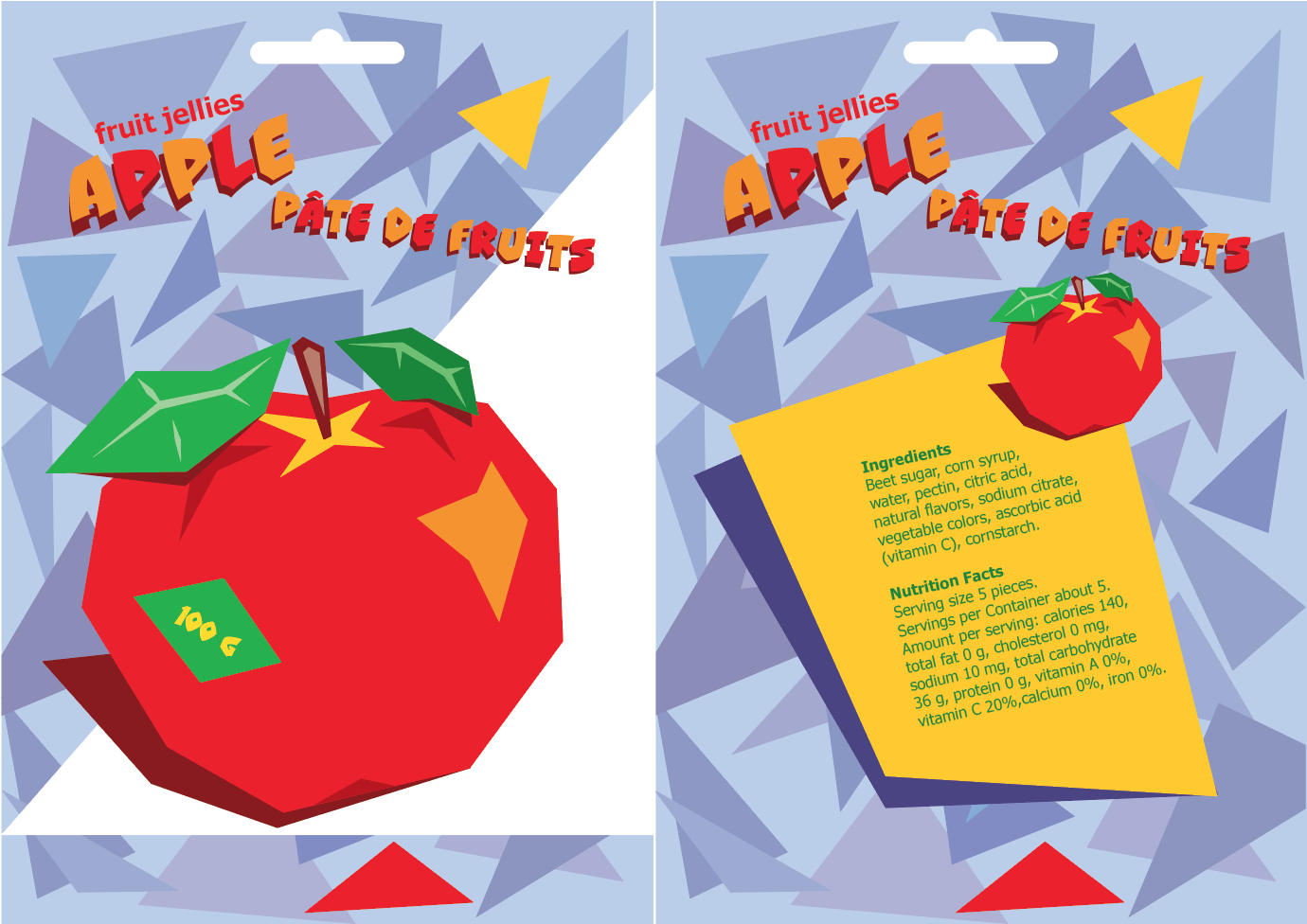
English
Orange
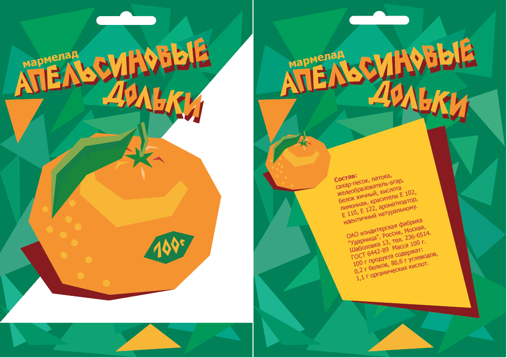
Russian
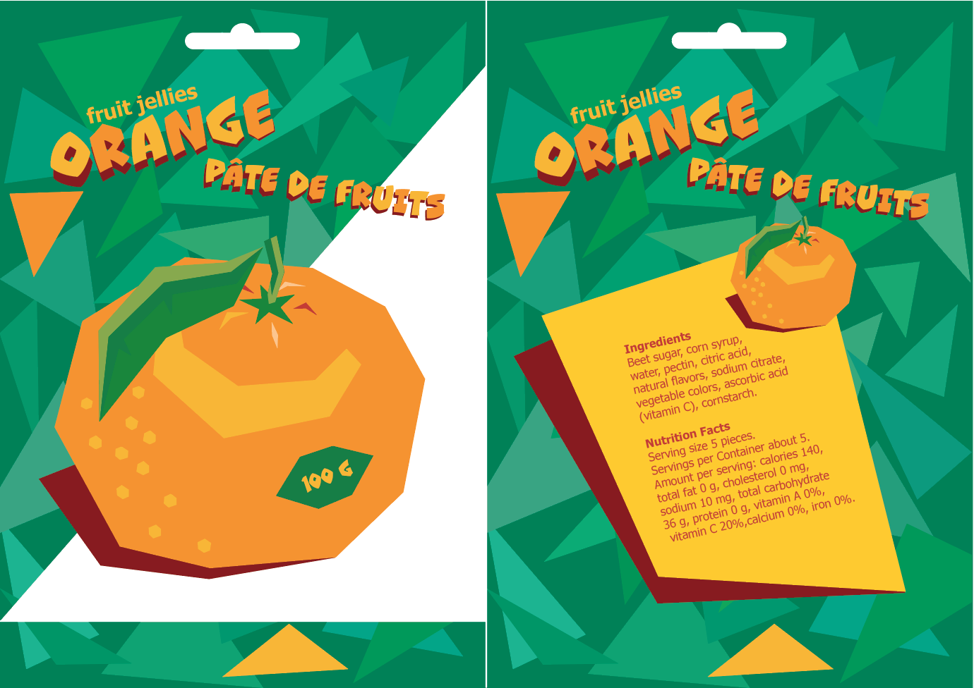
English
Pear
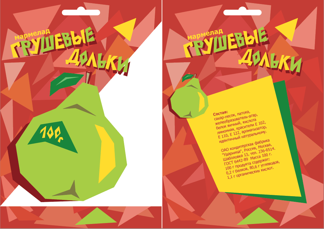
Russian
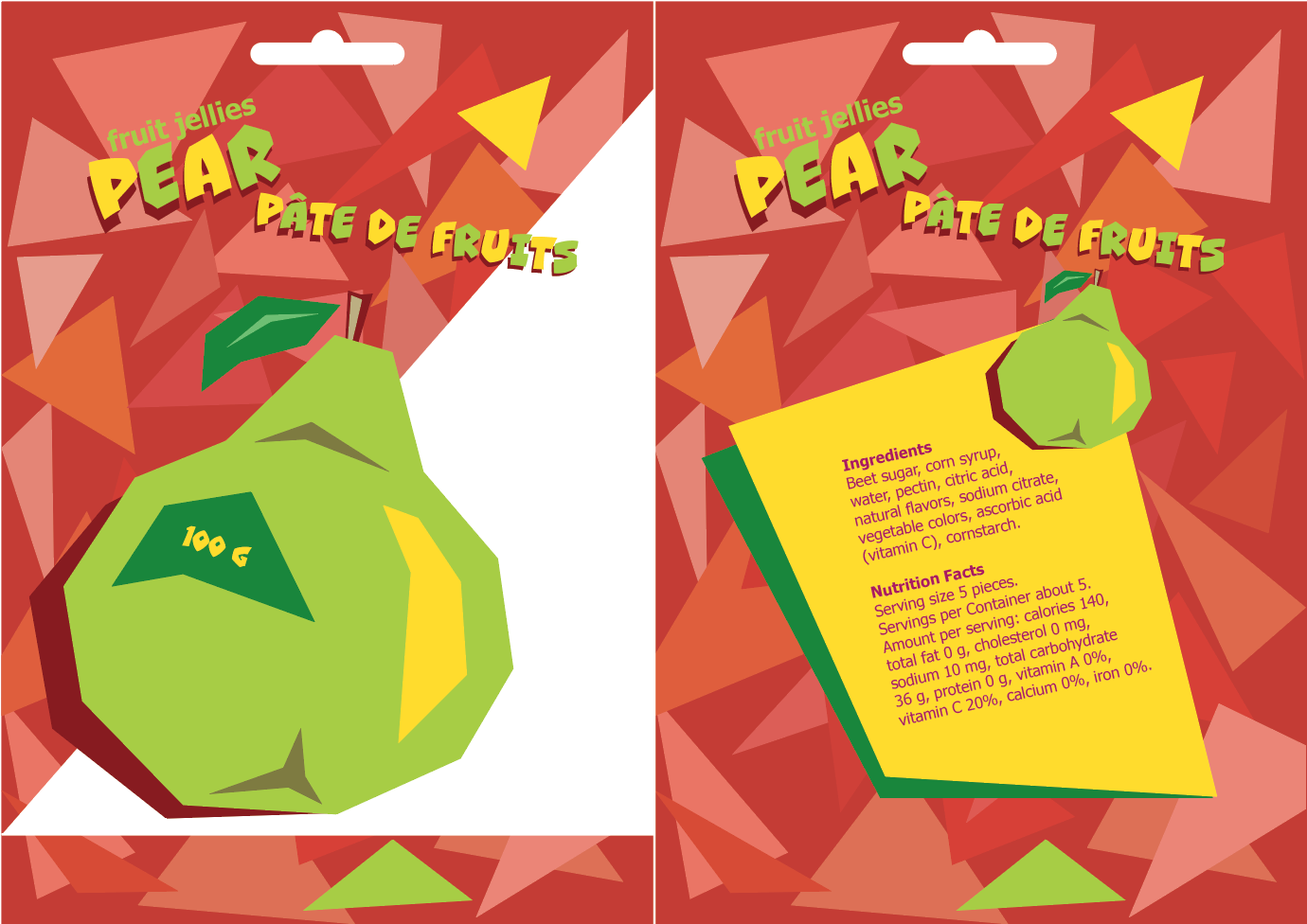
English
Banana
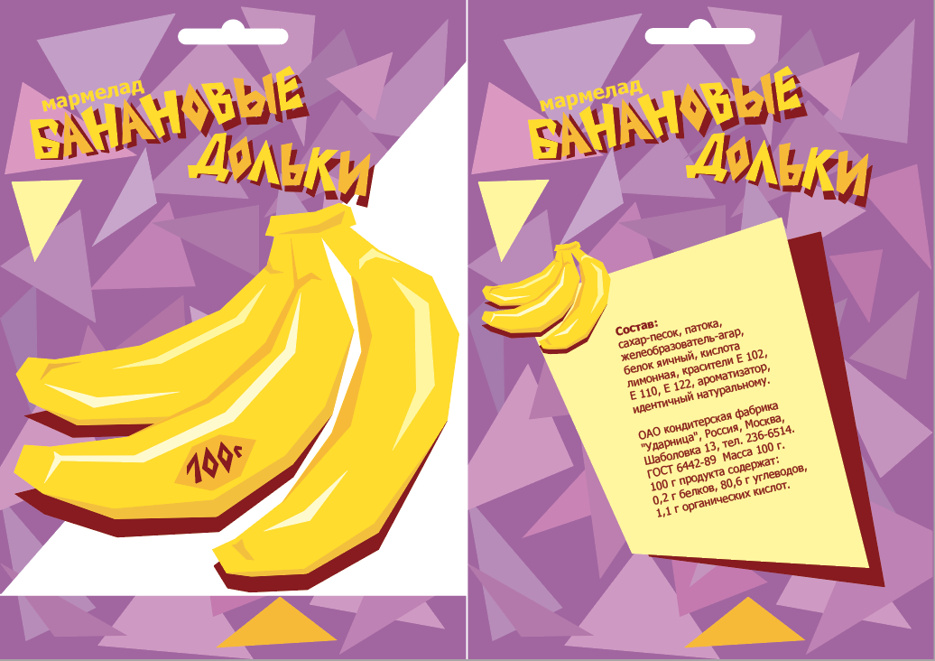
Russian
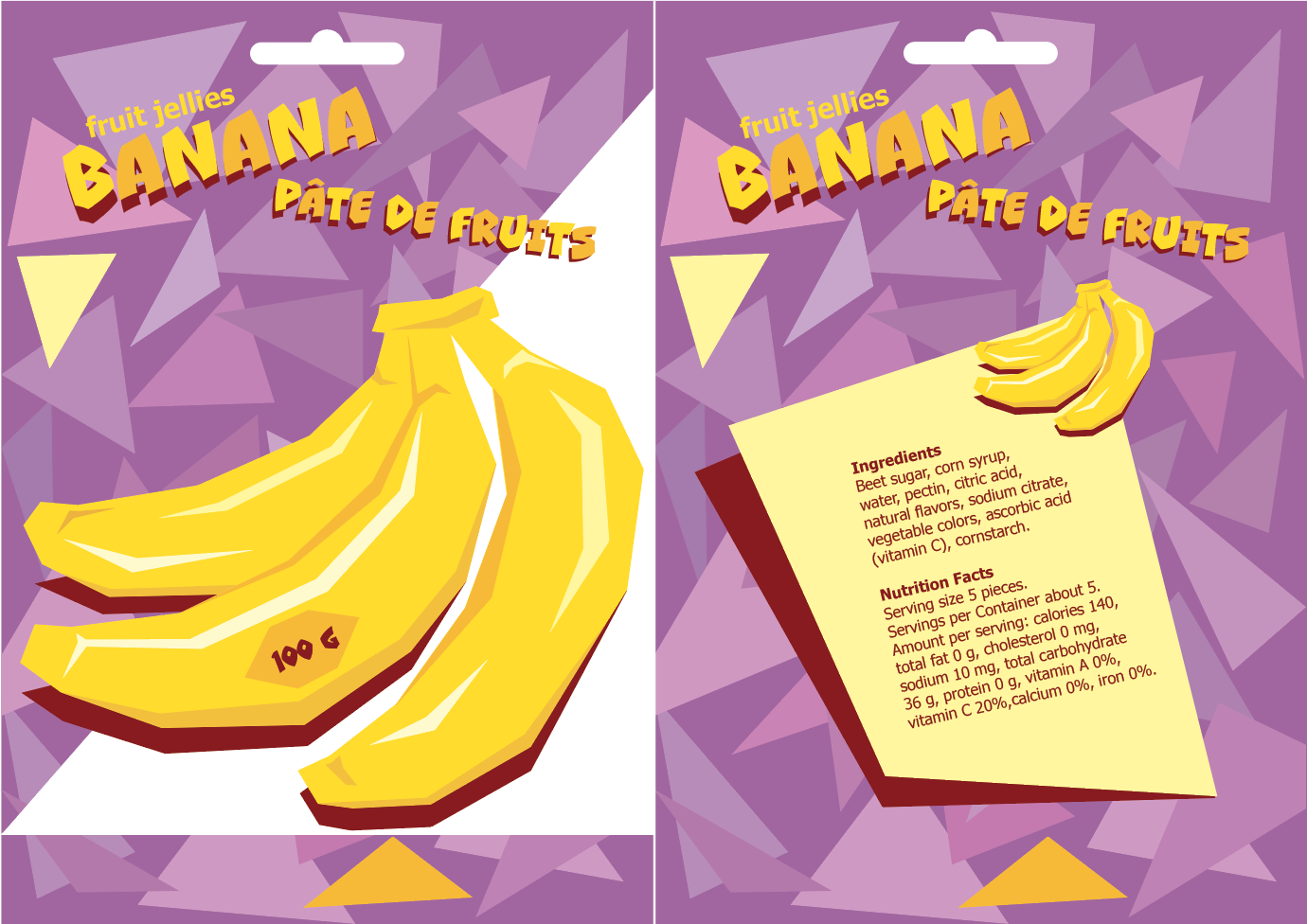
English
Conclusion
As we can see, the general style and idea of the original design is recreated well. The substitution font is a little fuller and rounder than original lettering, thus conveying a bit different, calmer and quieter appearance to the overall project. Probably in real life it would attract a slightly different demographic.